My goal for this project was to gather everything I had learned over the course of 1.5 years and attempt a super simple, print redesign of the current label. I’m imagining that this is something any museum could implement and print on an 8.5″x11″ sheet of paper. I’m imagining it could work as a bench card, where it would exist off the wall and the user could hold it. This is not perfect, just a rough prototype for a potential redesign. Feedback always encouraged!
I worked on this piece at the Blanton:
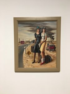
And this is the label:
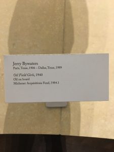
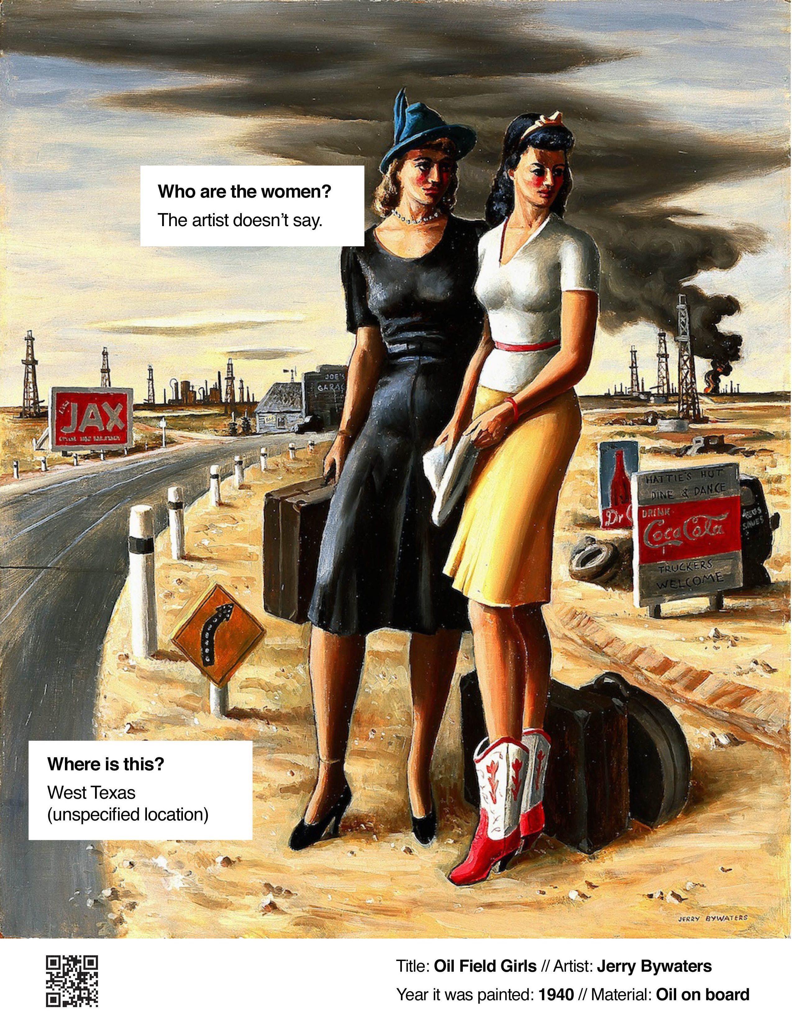
I chose this piece of art, simply because it always appealed to me. I was interested in learning more, but the label is pretty basic. After doing some preliminary research about the art, I could create a label based upon my knowledge of what users want to know about art. For my first iteration, the most important thing was accessibility. I increased the point size about 400%. I also included an image of the art – this is in response to the idea that most people interact with labels when they take a photo on their phone so they can look up the art when they get home. By including a reproduction of the art on the label, it can avoid confusion as trying to remember which art went with which label. It also allows for the label to remove from the wall.
I also wanted to include a visual description in the label, as inspired by the Alice app developed by the Harvard Art Galleries. I also included basic information about the art, that would allow for a user to google and find the art quickly and easily.
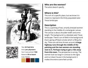
In my next iteration, I switched the image to black & white to help clarity for those with visual impairments. I also added a QR code for screen readers or to give the option of different languages.
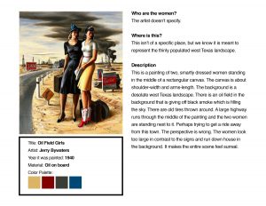
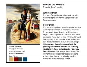
I thought there was still too much text, so I simplified it creating the above label.
But while that design satisfied some needs, it just wasn’t visually appealling. I decided to try a different (accessible sans serif) font and play with composition. Text size got slightly smaller, but it’s still about a 300% increase of current label standard size (the current font size in this label is 14 pt).
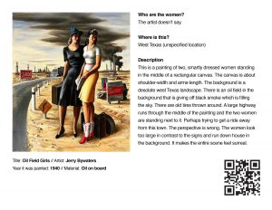
The final version I ended up with was this:
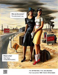
While this version isn’t perfect, I think it’s at least visually more engaging than the others. The art is at the focus. The questions about the art are tied to specific points of the art and call attention to different areas. The basic information feels secondary to the content. And there’s still a QR code for screen readers. I’d like to try this method again with a non-figurative piece of art and see if it works as well.