This past semester was dedicated to honing my thesis topic. In Design Lab, I furthered my research by conducting interviews about museum labeling and art interpretation. I also developed personas and journey maps in order to refine my thesis hypothesis. The journey map forced me to consider museum UX design and how context can play a larger role in the museum world. To truly make the museum experience accessible, interpretation must be considered beyond the label – visitors should walk into a museum space feeling comfortable and confident in their desire learn.
While Design Lab focused in research, Critique Studio was all about making. For the first project of the semester, I developed a digital component to “Museum of an Art.” Last semester, I developed Museum of an Art as an opportunity to ask non-museum visitors what they would want to know about a piece of contemporary art. At the start of this semester I was interested in creating a digital version of this project, however, the project’s aim grew into a satirical look into labeling. Objectify This Art asks viewers not just what they want to know about the art, but to write a label for the random piece of art that is shown to them on screen. The answers I received were pompous, mimicking the often elitist language in an art museum. These results perpetuated the idea that museums are exclusive, not inclusive.
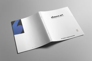
The satirical nature of Objectify This Art inspired me to try another satirical project called “Almost Art.” This was a fake, traveling exhibit that showcases the random architectural elements in an art gallery (outlets, power strips, exit signs etc.), that are placed close to the art but not classified as Art. I labeled these random non-art art objects and created an exhibit catalog.
The final project of the semester was an analytical approach to my thesis; I attempted to redesign the label. While I had done this in various iterations and prototypes in previous semesters, I wanted to take what I had newly discovered this semester and try a redesign. I went about this in two ways; firstly, I developed a simple, print redesign of a label and another was an augmented reality version of a label.

The printed version of a label needed to meet a series of requirements; I wanted to make the text size larger than current label standards, I wanted to incorporate new content based on the research I had conducted on what visitors want to know about art, and I wanted to make sure the image of the art was on the label. I go into more detail about this process and how I got to the final version here.
The augmented reality version of the label is a continuation of an idea I developed at the end of last semester. One of the things that bothers me about the current method of labeling is the under-utilized spatial environment. Currently, we view art in a museum very similarly to how we view it in books – by looking at it and reading the context in a flat, two-dimensional setting. I wanted to use the three-dimensionality of a museum space and have content appear to the visitor relative to where they0 are standing in relation to the art. When a visitor holds up their phone, different content appears to them on a z-axis. As they get closer to the art, new information appears. This allows the visitor to think and view the art more spatially than before.
My plan is to continue both directions of labels. While neither are the perfect solution, they meet different requirements based on the six principles I developed earlier in the semester. The printed version is easy to implement for any museum and cost-affective. It could potentially inspire a new way of designing the label, rather than creating another bandaid or program on top of pre-existing issues. The second approach is innovative and a completely new way to understand art. It also allows for accessible adaptability (languages, font size, audio could all be easily toggled on and off if this was developed into an app).
I believe that the biggest thing to come out of this semester was the development of my six design principles to redesign the museum label. Before Review 2, I collected everything I had learned thus far and created a rule book for an object label redesign. The six principles and an explanation for each principle are described here. Developing these principles allows me to analyze current and new approaches against a set of metrics which would hopefully keep the most important elements of my thesis in check.
The feedback I received after presenting this idea during my Review 2 was generally positive. The biggest concerns were around principle #3 (the artist’s POV must be made present). The concern was that artists do not always know how to write for a larger audience. Would forcing the artist to write their own interpretation actually create inaccessible content? When speaking to Seema Rao recently, she told me that she strongly believes in people doing what they do best. Meaning, the artist is best at creating and making. A trained writer or educator is best at interpreting that art into accessible content. This winter, I plan to meet with several artists and ask their opinion about interpretation and label writing. While I’ve met and spoken with many museum visitors, non-visitors, art historians, museum educators, designers, interpreters, activist, and writers, I have yet to speak with any artists. I’m hoping that by gaining an artist’s perspective, I’ll better understand their desired methods for interpretation.
The other main feedback I received from Review 2 was that I haven’t dived deep enough into my investigation of the label. While I had created methodology around labeling, I needed to do more testing and prototyping of actual museum label designs. This feedback is what inspired project three for Design Lab. I’m starting to design labels, not just talk about designing labels, and already learning pros and cons for various label design methods. My hunch is that different museums will benefit from different types of label designs. I’m hoping that I can build a library of design approaches that museums could refer to as inspiration for interpretative design.
My plan for the winter break is to work on my 2D and AR label designs and continue to build my label library. My spring semester will be especially interesting, because I’ll be tasked with creating an exhibit about exhibit labels. I have two ideas that I’ve been continuing to develop. The first one is labeling all the work of the current design grads. This would allow me to test my thesis work in an actual gallery setting. The trick to this is that the work is design and not art. My thesis focus has mostly surrounded contemporary art, so I’m unsure if the interpretation methods I’ve developed would work as well with designed artifacts. It could also hinder how the other students wish to display their work. I would hate to take away an opportunity for them to design their exhibit (how they feel it should be designed, interpreted and displayed). The second idea is to create a mini art exhibit in gallery space and test out my label methods on one single piece of art. If I create a “museum of an art” installation, but then have multiple methods of interpretation surrounding the single piece of art, it would showcase my research, prototypes, and methodology. I could also ask for feedback (satisfying the need for feedback loops) and use this opportunity to test my thesis further.
I look forward to continuing to refine my principles in the research class next semester as well as refining all my prototypes.